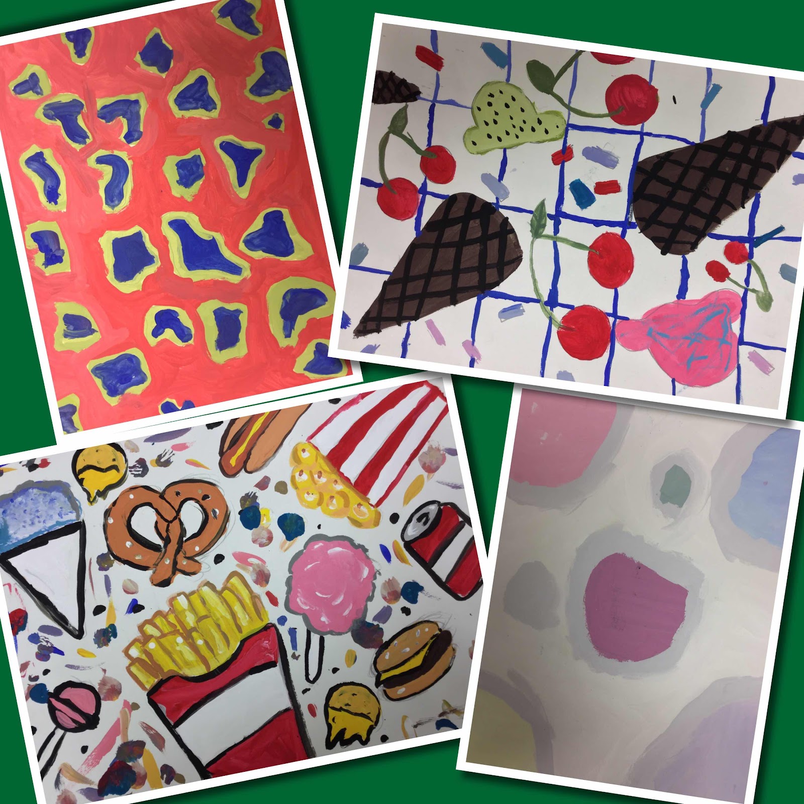
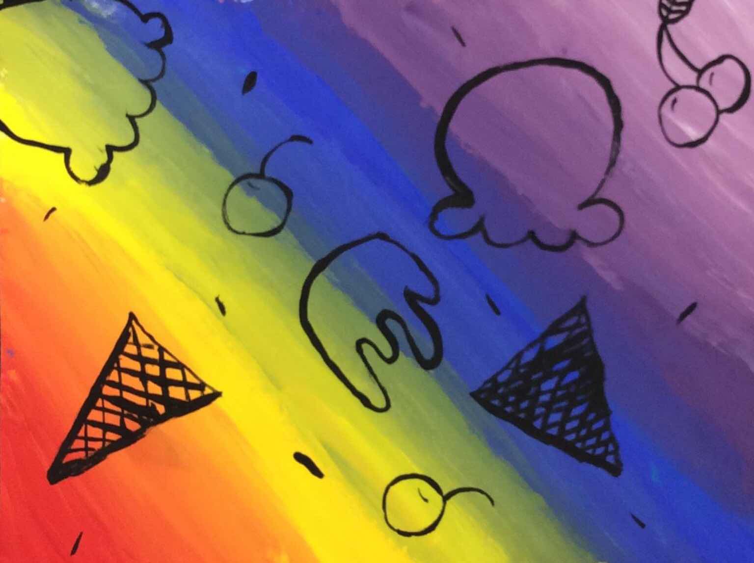
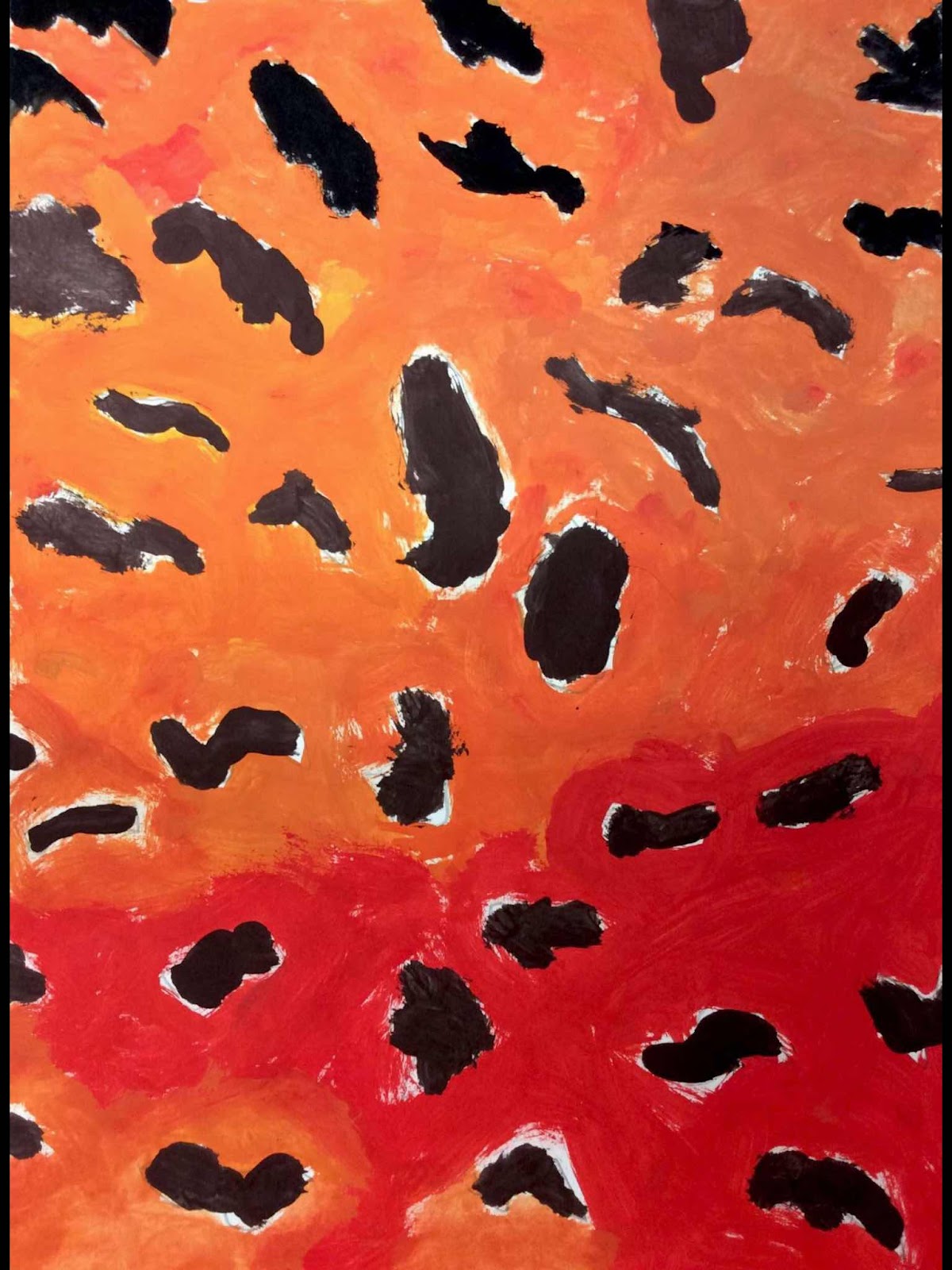
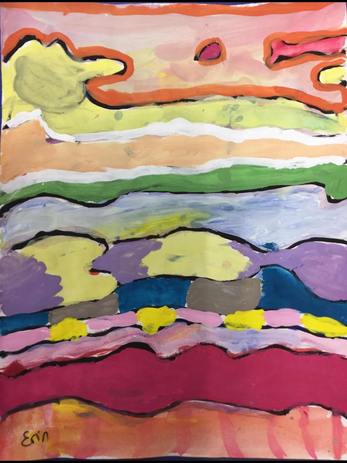
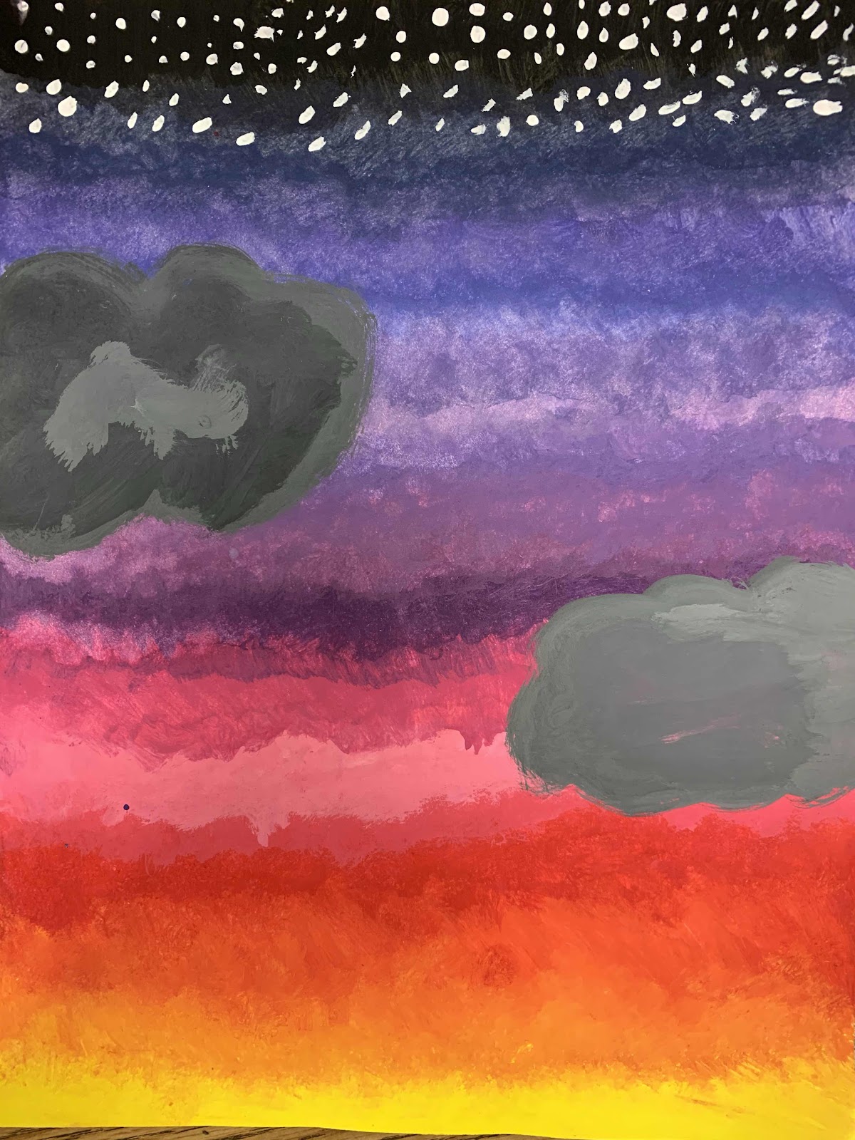
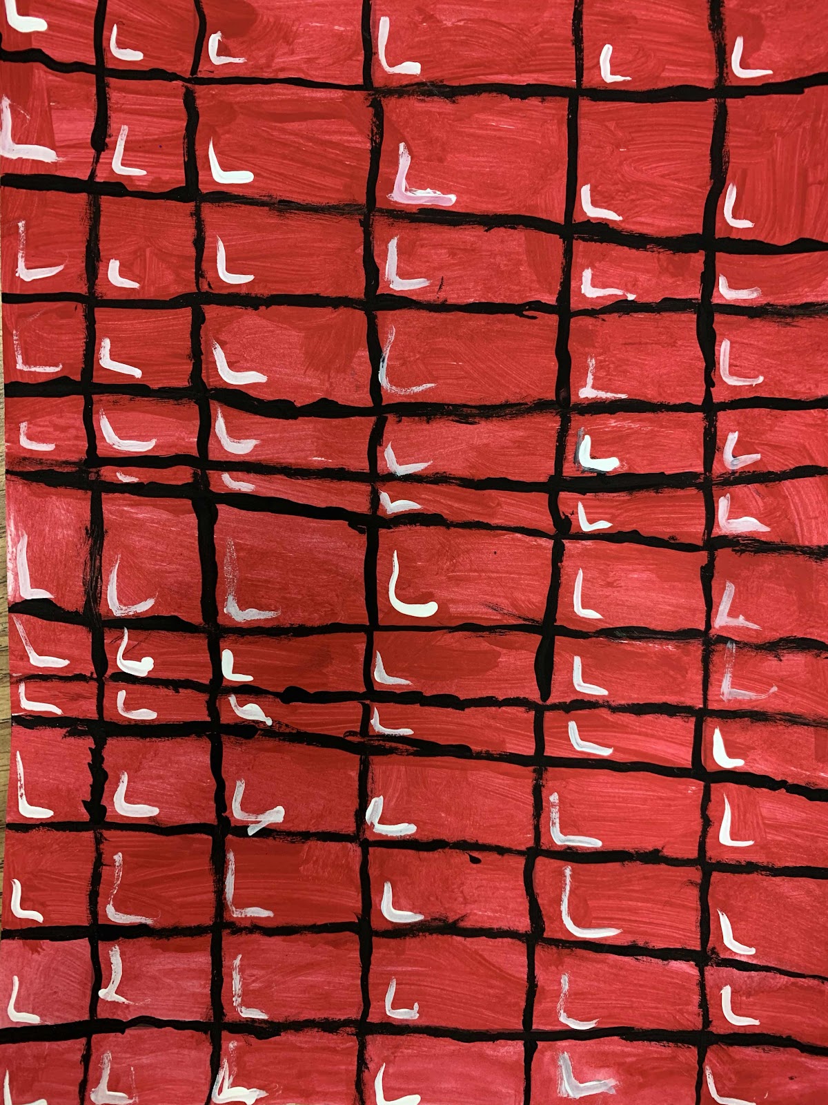
Fourth graders have been exploring color schemes the last few weeks and our end result is a beautiful
nonobjective style painting! Artists work in three basic styles: realistic (looks like real life), abstract (based on real life objects but changed artistically), and nonobjective, which uses elements of art like shape and color as the subject itself, rather than an object from real life like a house or a person. We often call this type of art "a design."
We started by selecting a pair of opposite colors from the color wheel, called complementary colors. We painted a paper with the hi and lo intensities of the pair in 4 sections - to lower the intensity, or brightness, of the color, just mix in a tiny bit of its complement! We often need lower intensity colors when we are painting from nature.
When the paintings were complete, we paired up with a partner and reflected on our learning using a 321-Art! sheet.