

Fourth graders have been exploring color schemes the last few weeks and our end result is a beautiful nonobjective style painting! Artists work in three basic styles: realistic (looks like real life), abstract (based on real life objects but changed artistically), and nonobjective, which uses elements of art like shape and color as the subject itself, rather than an object from real life like a house or a person. We often call this type of art "a design."
We started by selecting a pair of opposite colors from the color wheel, called complementary colors. We painted a paper with the hi and lo intensities of the pair in 4 sections - to lower the intensity, or brightness, of the color, just mix in a tiny bit of its complement! We often need lower intensity colors when we are painting from nature.


The next week, we used the same colors and created tints and shades using black and white. We used these new values to paint a variety of lines and patterns over our backgrounds. It was great practice using our brushes for thick and thin expressive line.
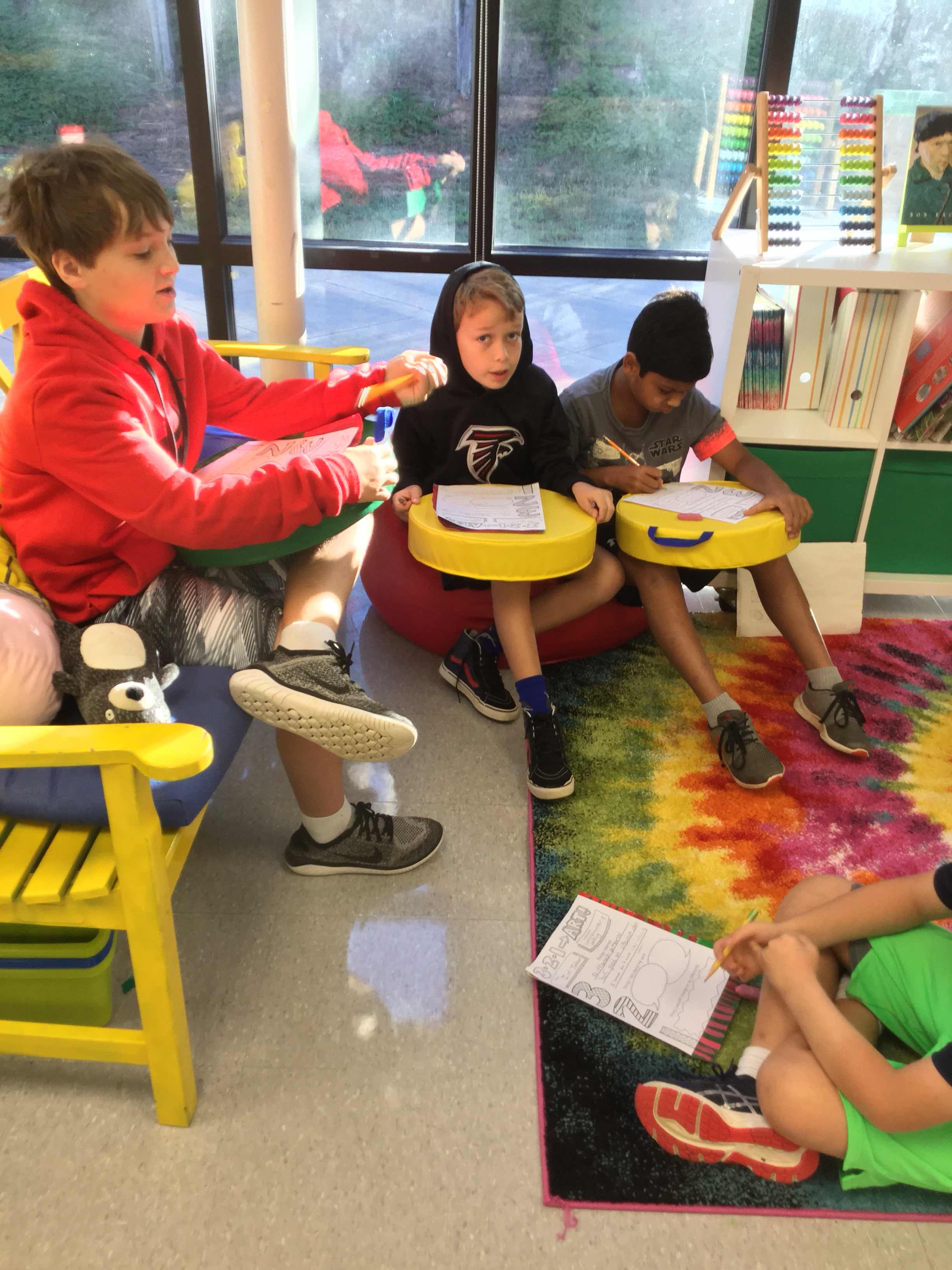
When the paintings were complete, we paired up with a partner and reflected on our learning using a 321-Art! sheet.


These are gorgeous!
ReplyDeleteHi! Do you have a sample of the 321 art sheet? Can you email to me? Daitaliana23@aol.com
ReplyDeleteThanks! These are great!