Comparing compositions of two different artists is one of my favorite things about teaching art. I have posted before about this lesson, and it is such a good one I am happily posting again with this year's second graders. American painters Norman Rockwell and Jackson Pollock seem to have nothing in common - Rockwell was narrative with a skillful, realistic technique and Pollock, aka "Action Jackson" was an abstract expressionist bursting with energy and movement. Pollock died young and had a limited number of completed works, while Rockwell had a long career and many many works. However, they both were born in the early 1900's and lived in the northeastern part of the U.S.; they also worked in old barns converted to studios. They both painted on large canvases, although Pollock's were rolled on the floor and Rockwell's were painted on an easel.

Rockwell made a painting called The Connoisseur in 1962, showing an art critic or collector at a gallery, taking in a painting resembling the drippy, splattery style of Jackson Pollock. My second graders put themselves in the shoes of this art expert, posing in a thinking pose and shooting pics of each other for our renditions of this iconic image.
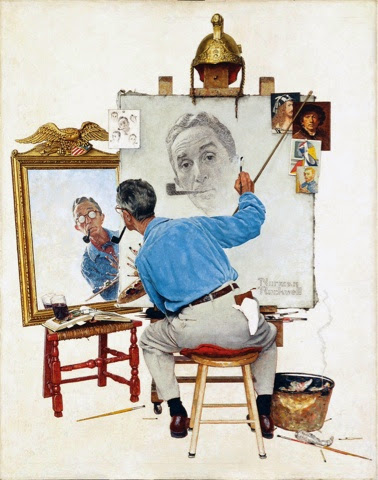
We tried out both artists' styles, first creating a Saturday Evening Post cover imitating Rockwell's Triple Self Portrait, 1960, and then working at a 4-part action painting station. Students shared their thoughts on which artist they preferred, and the majority said they liked both for their own unique qualities, making our "mash-ups" all the more meaningful.
Blue Poles, number 11, 1952


What a Great idea Hope! I love seeing the differences of the two artists working in their studios. I bet the kids really enjoyed this lesson.
ReplyDeleteI love all these pieces, but I especially like the way you had the kids do their "Pollock" work within foil trays -- Why have I never thought of that!!!!
ReplyDeleteI keep seeing this lesson and each time it makes me want to do it more and more!
ReplyDeletehttp://art-explorers.blogspot.com/
Wonderful! How did you place the photos of the students? Are they cut out and glued to the paper...or is there a technical trick to this? If you have more artists you've compared and contrasted I would love to see and hear about those also! Thanks for sharing. :)
ReplyDeleteHi sandrakay - yes, the pics are simply printed, trimmed and pasted on top - lo-tech style! I do another comparison lesson using Charley Harper and JJ Audubon, you can see it here:http://dolvinartknight.blogspot.com/2013/10/harper-and-audubon-bird-portraits.html
DeleteI am bringing my lesson out of retirement! I have used the 'marble' technique, but not in combination with Rockwell's compare/contrast. Great idea. Question: what is the finished size of the art work? Looks like 12x18 construction paper? Thanks so much.
ReplyDelete12x18 would be best, these are actually 9x 12 so that they would work for the display - good luck!
Delete