Pages

Thursday, September 27, 2012

Landscape painting, 2nd grade style

Second graders learned the three parts of a landscape, as well as different techniques for creating space in a landscape: size changes, placement changes, and value changes. We drew our landscapes with crayon, mixed different values of blue and green tempera, and added the details with oil pastels, remembering to make size changes as the flowers moved from the foreground to the background. I really think these are charming, and I love the repetition of the organic sheep's wool in the clouds!
I was inspired to create this lesson by this post on Artsonia.


Tuesday, September 25, 2012

Photography club: getting started

Our club has met 3 times so far, and we have learned the different functions on the camera and some very basic editing options, as well as learning to save our work from the camera folders on our laptops into our individual folders. Our first photos were taken outside, looking for lines and shapes in our surroundings. During editing, we talk about creating an interesting composition through positive and negative space. Next, we are planning to move our pictures to an online gallery, so students can work on them at home or share them with family and friends, and eventually create a club blog. Here are some of our very first "elemental" pics of lines and shapes...


Friday, September 21, 2012

Who is your favorite Pop Artist?

Warhol, Lichtenstein, or Thiebaud? This is the question asked of my 4th graders in the educational DVD "Who Is The Artist?" Students made notes about the characteristics of these 3 American masters and selected one to be the source of inspiration for their personal take on a contour line still life drawing. Those who chose Warhol drew grocery store items and focused on repetition or advertising, while Thiebaud fans focused on sweets with cast shadows and displays. Lichtenstein fans drew their shoes in a comic book style, complete with Ben-Day dots.

This Lichtenstein painting, featured on the DVD, was just uncrated here at the High Museum for a fall exhibit!


Special edition soup cans, just in time for my Pop unit!
Some of my current fourth graders, when we went to the Warhol exhibit last year

Thursday, September 20, 2012

Collage and Illustration, 1st grade


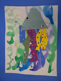
1st graders learned about the art of some of our favorite book illustrators, and combined cutting, painting and gluing skills to make an octopus/giant squid/jellyfish creature. I have done an Eric Carle inspired collage in first grade for many years, and this year I combined it with my new book purchase, I'm the Best Artist in the Ocean by Kevin Sherry. I found this super cute octopus collage example at "flipflops and applesauce" blog.

Eric Carle's collage technique combined with a funny story by Kevin Sherry - two great illustrators!

We began with cool color wavy lines for our ocean backgrounds.

We selected a patterned paper for the head and made a semicircle, a geometric shape.

We made arms from paper scraps, cutting wiggly, organic shapes.


Hole punchers provided the texture of the tentacles, and we used the holes for the bubbles.