Pages

Wednesday, November 30, 2011

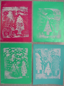
First Look at Evergreen Collagraph Prints!


Third graders are still in the printing stages of our Evergreen Collagraph prints, but they are coming out so nicely that I couldn't wait to share!  We will be trimming, hand-coloring, and numbering our prints soon.  So far, we have built a printing plate using a variety of textured materials like foam, woven fabric, sandpaper, and cardboard.  We cut a variety of evergreen tree shapes and punched holes for the "berries & cones."  We printed using white ink to represent the first snow of winter.  The prints are beautiful and the plates look really nice themselves!  Some of our "smudgier" prints will get some oil pastel detailing.  This project really put us in the holiday spirit - we are ready for winter!


building the printing plates


prepping for printing

rolling on the ink

placing the paper over the plate


the image prints in reverse


Monday, November 21, 2011

Abstract trees, 1st grade


teacher example
First graders looked at artist drawings of realistic and abstract trees and discussed why an artist might choose to make things look different than they do in real life.  We also reviewed secondary colors and making tints and shades.  We created the lines for the trunks and stems using silver and black sharpies, which tend to dry out quickly when drawing over dried tempera, so if you try this maybe use a metallic colored pencil..  We used this example from Pinterest (original artist: Eloise Renouf) to spark our thinking.


Wednesday, November 16, 2011

5th grade color studies underway... (+ snowmen)

As a painter and color enthusiast myself, I get really fired up for a good session of painting with the kids.  Fifth graders are beginning their nonobjective color studies, inspired by works from Paul Klee, Arthur Dove, and Sonia Delauney.  We completed a prep sheet with thumbnail sketches, plotted compositions, and mapped out color schemes, then dove right in.  After umpteen years of washing paint trays, I finally figured out how to use lidded condiment cups and magazines as palettes - just peel off and toss!  Super easy. 

working with a monochromatic scheme

and analogous


and complementary


inspirational posters with student art

On another note, last week, I had a group of students who I don't usually see come for a lesson, so I decided to try out a craft - something we typically don't have in our curriculum, but this was not a "regulation" day so we went for it.  Found on Pinterest, click here for original site.


Grant Wood style pumpkin farms

Kindergarteners learned some tricks to create the illusion of depth of space in their watercolor landscapes.  Artists place objects low on the page when they are near, and higher on the page when they are far.  Artists also change the size of an object to show where it is in space.  Our pumpkin farm landscapes have the feeling of rich, rolling hills like those in Grant Wood's paintings, and each student chose a daytime or nighttime setting and color scheme.  Wood was an American master, known for his rural landscapes and the iconic American Gothic, a portrait of the farmer and his wife.