Pages

Friday, September 30, 2011

100th post: Charley Harper bird collage


Charley Harper
 American artist Charley Harper is one of my favorites in terms of style.  His slightly abstract nature scenes are very simple and geometric, making it easy to find emphasis in the picture, or showing what's important. Our 3rd grade collages were inspired by his geometric, sparse style.  We also looked at the realistic bird paintings of John James Audubon and compared the two styles.  We incorporated visual texture by using newspaper to represent the black and white texture of birch tree bark, and scrapbook paper to represent the textures of feathers and nests.

*update* My student Alondra brought her writing journal to class to show me how she had written about her enjoyment of this lesson.  Wonderful!


Wednesday, September 28, 2011

Photography: Cubist self-portraits


This lesson was done by my after-school computer art club.  These 5th graders looked at photo collages by David Hockney, which show an object or a figure from different points of view all at once.  They worked with a partner to snap 8-10 close shots from a variety of angles.  We used Publisher to edit, crop, and arrange our cubist compositions.


Friday, September 23, 2011

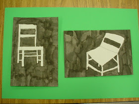
pen & ink chair drawings, 5th grade


5th graders completed two drawings of a chair

we began by drawing multiple views of a wooden chair

students enjoyed trying out the "old school" method of using ink, dip pens, and brushes
these negative space drawings were made with ink wells and brushes

the positive space drawings were done with old-fashioned dip pens and ink wells,
focusing on the visual texture of the wood grain


we agreed that modern pens are much easier for portability and neatness...

... but the old-fashioned materials provide a certain charm and style

artists can use old technology/materials  to create a vintage feel

...or newer ones for a more modern style

drips and splatters happen a lot when using ink wells


very beautiful and timeless works


Thursday, September 22, 2011

The Dot, grade 3


Peter Reynolds' book The Dot explores the idea of overcoming fear of failure through creative thinking.  Vashti is frustrated with her still blank paper at the end of art class when her teacher inspires her to "just make a mark and see where it takes you." 
We were inspired by this book to create a nonobjective design using dots, lines, squiggles, shapes, and patterns.  We started simply and kept adding until each student felt their piece was complete.  Some created emphasis by coloring a dot-shaped focal point, while others chose to add color over the entire composition.  Third graders were thinking like problem-solving artists with this lesson.  Enjoy!


Wednesday, September 21, 2011

2nd grade "free painting", aka Matisse's window views

Matisse
Second graders just completed part 1 of our unit on artist Henri Matisse, who made a number of paintings depicting the interior of a room with a view from a window.  After sketching ideas in our sketchbooks for window shapes and scenery, we "free painted" - no drawing on the page first. The students were all discussing how much fun it was to paint without the restrictions of pencil lines.  Their palettes contained only the primary colors and black & white, so they mixed their own color schemes, tints and shades.  The results are a loose, painterly feel with colors suggesting a bright or cloudy mood.  Love them!  Here are a few in the beginning stages...


...and here are some final results.